According to one definition, to be 'native', the species must have been present at the point when Britain became an island.
This happened around 8000 years ago as a result of a catastrophic event, known as the Storegga Slides, when a large section of the Norwegian coastal shelf collapsed, releasing a landlocked sea and triggering one of the biggest tsunamis ever recorded. The water struck the north-east of Britain with such force it travelled 25 miles/40 km inland, turning low-lying plains into the North Sea, and marshlands to the south into the Channel.
After this, melting of ice from the previous glaciated period continued to contribute to rising sea levels.
See: https://www.bbc.co.uk/news/magazine-12244964
How do you tell the difference?
The key difference is that the acorns of Q. robur grow on stalks, whereas the acorns of Q. petraea grow directly from the stem with no obvious stalk. If you can't find any acorns, or it is the wrong time of year, leaf features help you to decide.
An auricle means a 'little ear'. The leaf blade of Q. robur is extended into small flaps on either side at the point where the blade meets the petiole, or leaf stalk. In Q. petraea, the leaf tapers to the petiole.
The Birnam Oak is an example of Q. petraea. The tree is at least 500 years old, one of the last remnants of an extensive oak forest.
20th October proved to be a mild and glorious autumn day.. perfect for sketching and photographing this ancient tree:
Sketching pencils from Derwent have a wider core than graphic pencils. Both types are available in a wide range of softness/hardness. Grade F is a special grade for drawing, with a hardness somewhere between H and HB.
I use F grade Derwent, Faber-Castell and Staedler pencils for most of my drawing, with softer B, 2B pencils for shading. The softer pencils allow a darker mark, helping to develop shadow areas. Experiment with different ways of holding the pencil, and different ways of making marks. Removing graphite with a precision eraser can be a good way of indicating texture.
I am a bit of a fan of pencil extenders. These improve the balance of the pencil and allow you to keep using pencils which have become shorter/much shorter through use.
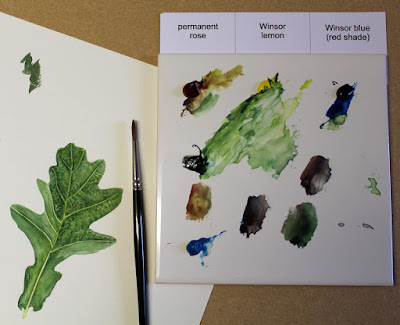
Back at the Institute, we explored colour mixing:
It is a mistake to think that you need huge numbers of different colours of pigment to develop a watercolour painting.
Winsor & Newton recommend the following pigments for a three colour system of primaries:
Winsor Lemon
Winsor Blue (Red Shade)
Permanent Rose
For a six colour system, the colours are:
YELLOWS: Winsor Lemon, Winsor Yellow
BLUES: French Ultramarine, Winsor Blue (Green Shade)
REDS: Permanent Rose, Scarlet Lake
I have found it effective to work with the three basic colours, with occasional additions of other colours. In particular, I often use Indigo and Cerulean Blue, and sometimes Winsor Yellow.
This approach keeps colour mixing simple. Once you have mastered mixing from just three primaries, you can experiment with adding new colours to your palette.
Many botanical painters avoid using green pigment, preferring to mix greens from blue and yellow. As you go, you can subtly adjust the mix, a little more yellow for a lighter green, or a little more blue for a darker shade. This avoids painting a uniform block of the same colour straight from the tube. Adding a hint of red makes the mixed colour less vibrant and allows you to match a whole range of additional colours.
Remember, your TV is an RGB device, meaning that all the colours you see are achieved by mixing Red Green and Blue light. (Mixing colours of light is different from mixing different pigments)
Your inkjet printer is is a CYMK device. All the printed colours are mixes of Cyan (turquoise blue), Yellow and Magenta. 'K' means 'kappa' and refers to black ink. Darren Woodhead, a wildlife painter, worked successfully for years with a basic palette of cyan, yellow and magenta as an alternative to the traditional primaries.
If your TV and inkjet printer can match a vast range of colours using just three different primaries, so can you!
Watercolour generally involves layering. I began my painting of the leaf in the photo with a yellow green wash along the line of the midrib and main veins. This was allowed to dry before painting with dark green to fill the areas between the veins, taking care to keep a fine line at each side of the vein. Lay down a line of a darker colour next to the vein, rinse your brush, remove excess water and soften the edge of the darker colour, merging it into the main part of the leaf.
Once your first washes have dried completely, surface detail is added with stronger colour and a dry brush. You can also lift out detail with a small brush.
Think always about where the shadows fall and where there should be highlights. Good dark shadows help to define form.
When you have engaged with the subject of your painting by sketching and studying its form, there is no reason why you should not continue working from photographs...
These two photographs of the Birnam Oak were taken on different days. Both could be developed as paintings, or as rendered graphite images.
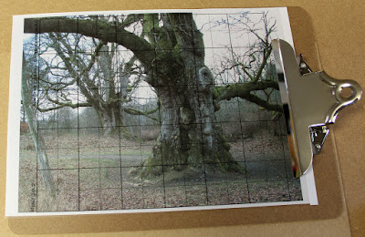
I think the Birnam Oak deserves a BIG painting. One method of scaling up from your printed photograph uses a grid:
My grid is printed on acetate sheet which I can put through my inkjet printer (email me at wdphillipsart@gmail.com if you would like me to send you a PDF). The grid is marked in 2 cm and 4 cm squares.
If you want to double the size, mark your paper as lightly as you can with 4 cm squares, or 8 cm squares, if you want to quadruple the original size. Draw grid lines in one direction, but use small short marks where the grid lines cross in the opposite direction to reduce the amount of rubbing out you will need to do later.
Using grids is respectable. Lots of professional artists do it.
I didn't use a grid for my large painting of the Birnam Oak, but I wouldn't have felt bad about it if I had!
This post completes on a cautionary note:
This is what storm Desmond did to the Birnam Oak:
Our ancient trees are under threat. Visit them before it is too late!


